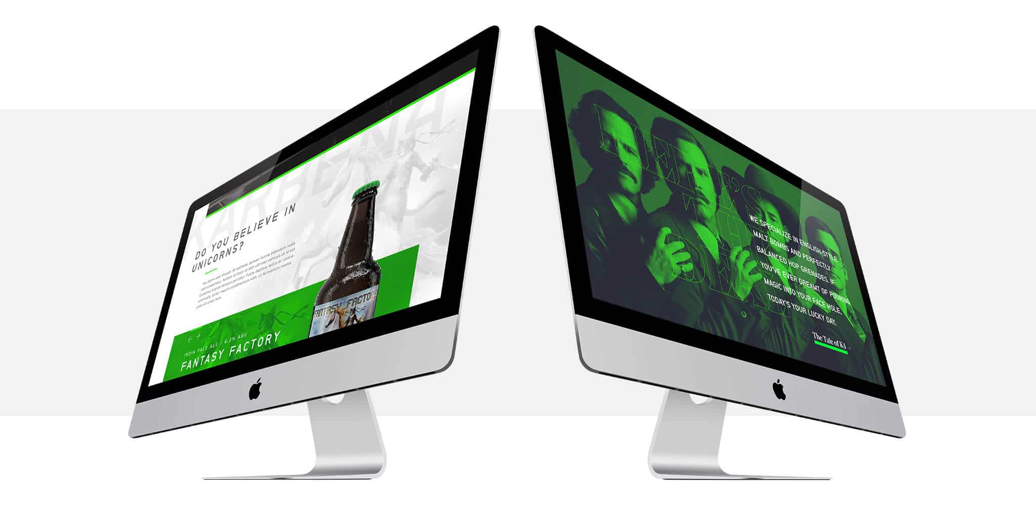
UPDATE – We won a 2016 Gold Addy and a Judges Choice for Karben4.com. You can read more about it here.
Where it falls exactly, we know not, but beer is most certainly on the short list of “Things That Are Fun.” But what are you to do when you’re a fun beer company with fun beer and a boring-as-dirt website? Karben4 answered that by coming to us to overhaul their website from top to bottom.
The Goal and the Challenge
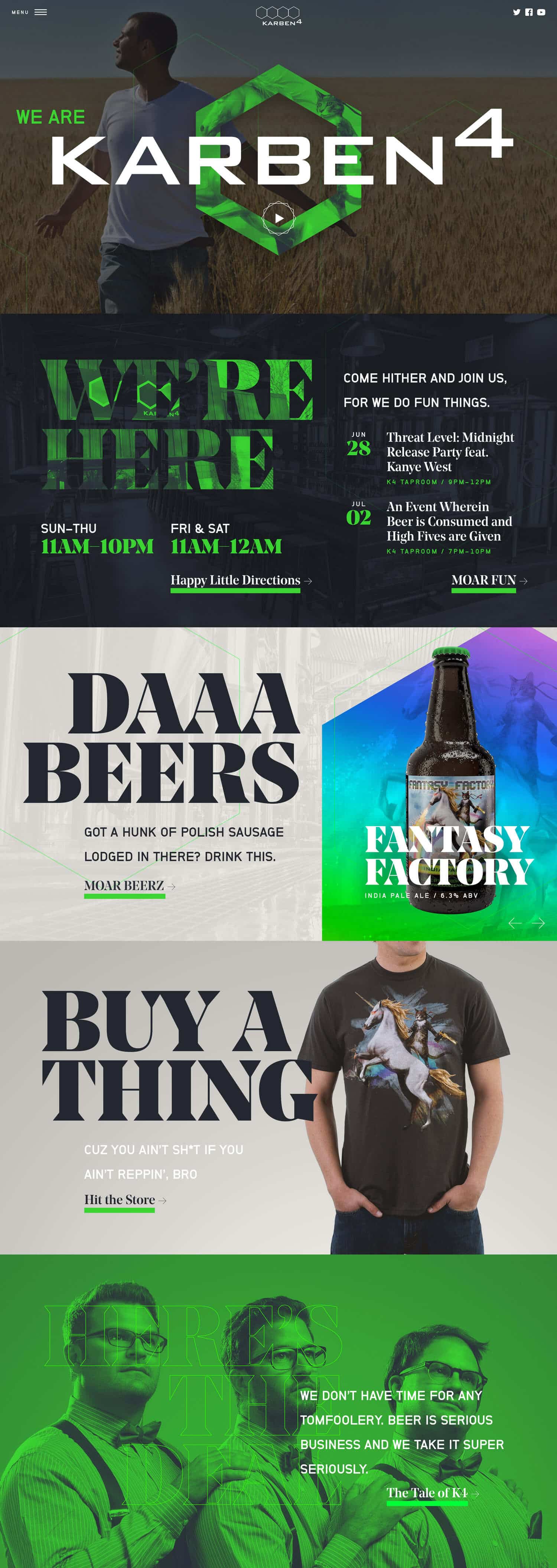
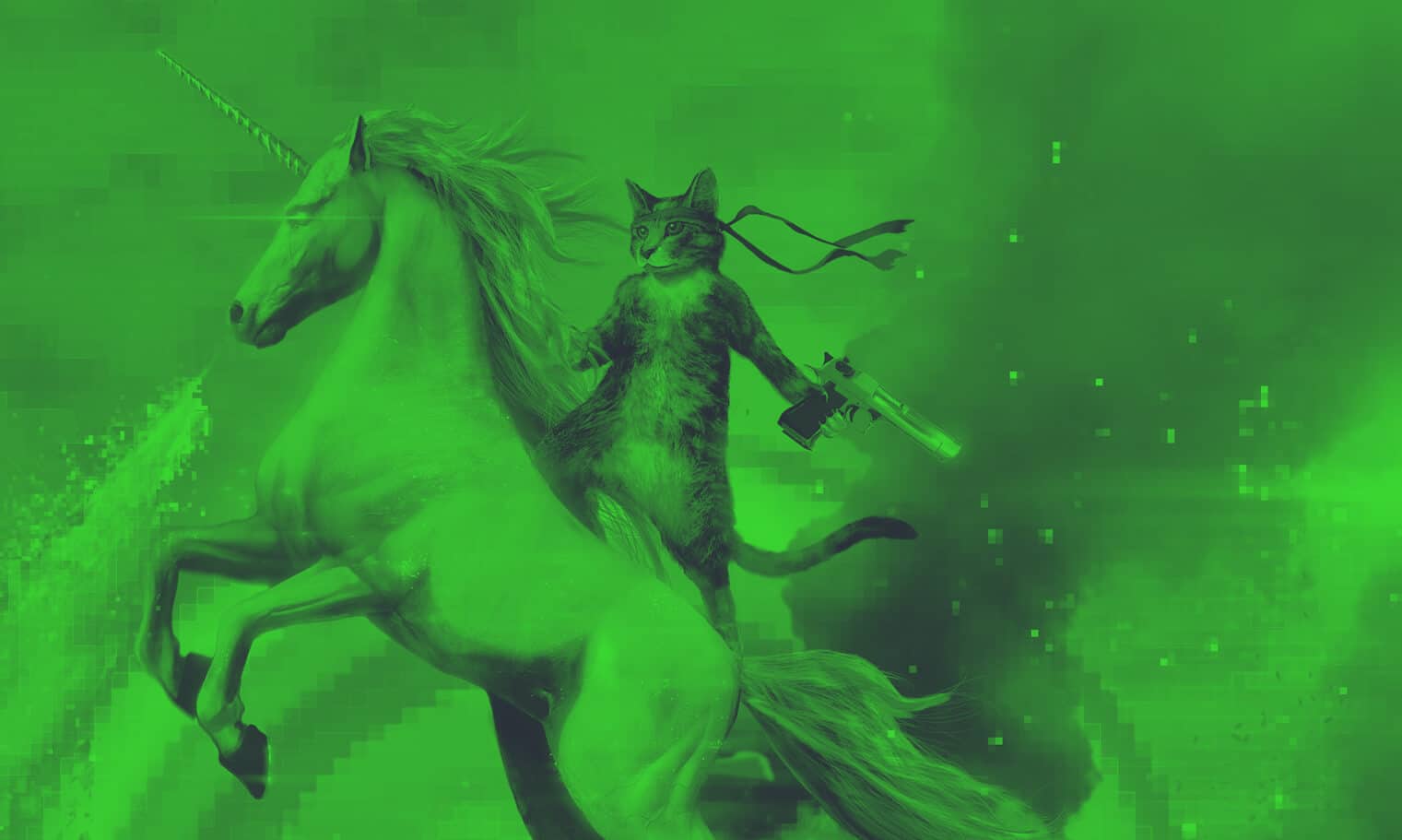
The top priority for the new website was clear: capture the voice of a company known for its playfulness and chutzpah. We’re talking about a group of men who felt that the best visual representation of their most popular flagship beer was a gun-wielding cat atop a fire-breathing unicorn. That’s a special kind of crazy, and the task of embodying that sort of zeal was set in front of us.
Another high priority, perhaps “Priority 1A,” was to bring the beer of K4 to the forefront. Not just the information, but the packaging, the art, and really the entire idea of these unique beers deserved to be brought out and allowed to shine.
Finally, of course, the site had to be usable and accessible. It also needed to be managed easily and quickly, because playing phone tag with a webmaster to try to keep things current was a tired fight.
Design Magic
The basis of any website design we do is typography, and this one was no different. We wanted to build a type system that was professional and harmonious, but that completely rejected the idea of being safe and cliché. We wanted something that was, for lack of a better term, “a little bit off.”
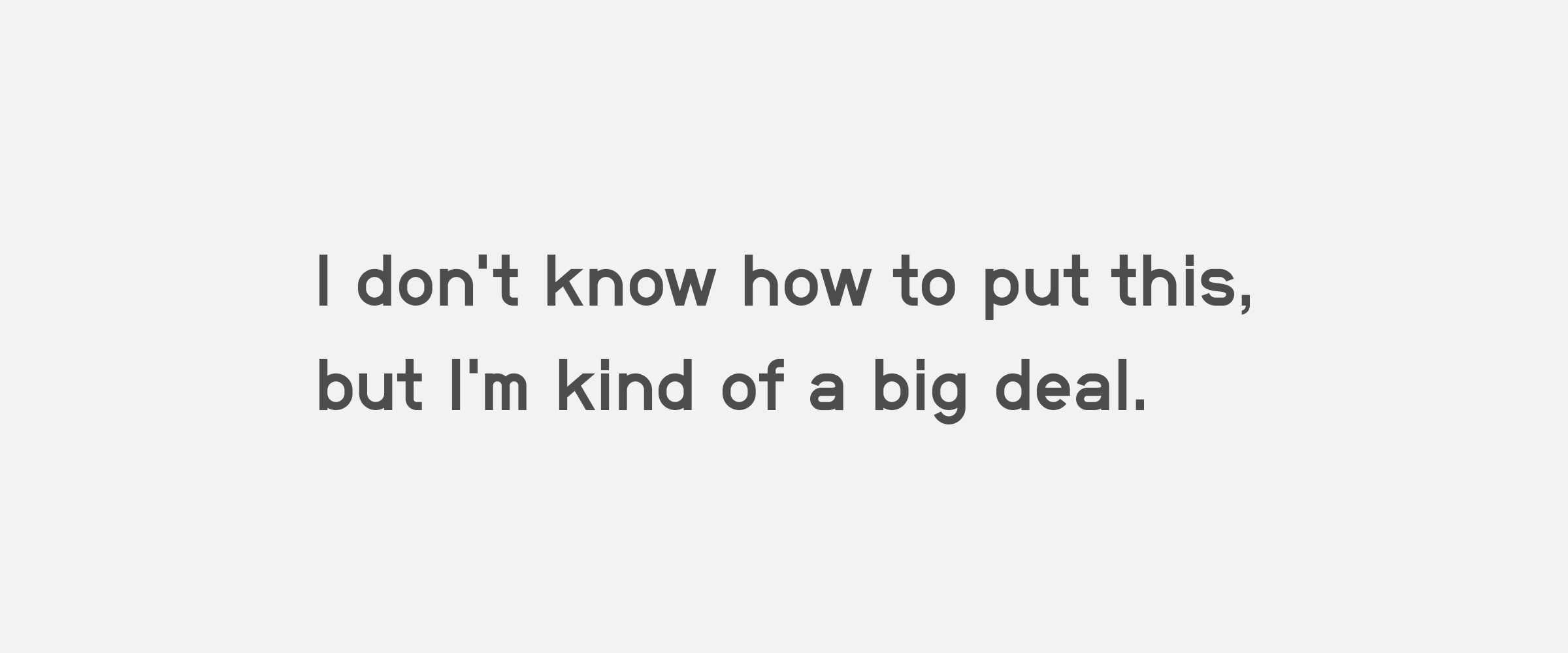
Wanting to feature a gothic, we found Neubau’s NB Grotesk, which fit the bill perfectly. The typeface was constructed according to a strict grid system and allowed for no optical corrections to the letterforms. The result is an unorthodox typeface that fits into this project perfectly.
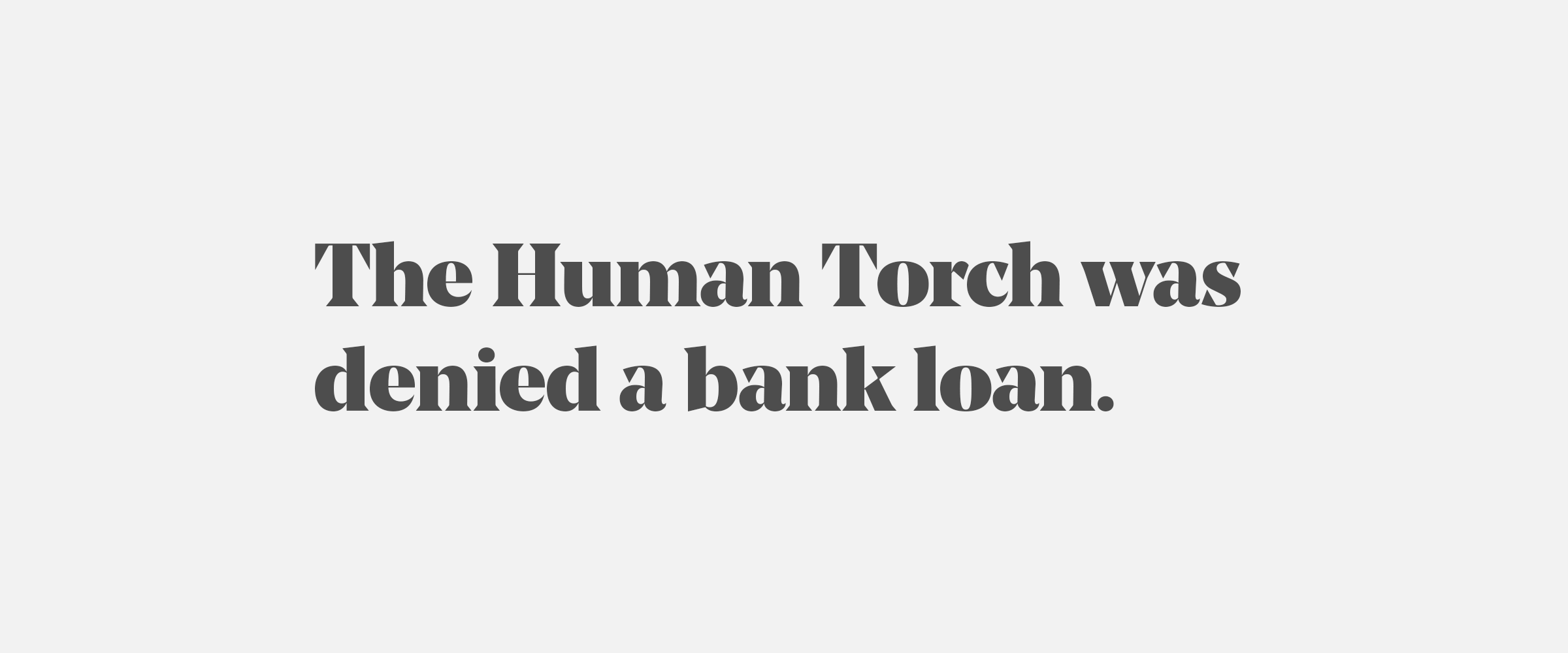
We also felt the need to bring in the elegance of a serifed face but maintain harmony with the quirkiness and rigidity of NB Grotesk. So, we set the big, bold headlines in Noe Display from Schick Toikka. Noe’s sharp, triangular serifs are incredibly distinctive and unique. It feels polished and refined but odd enough to be coherent.
With typography in place, we started with two distinct design concepts. Our hope with the design process is to convey both the aesthetics of the website and the overall brand voice. To do that, we use a combination of greeking and real-but-not-real sample text, as well as found images to simulate the overall experience of a user’s visit to the site.
60% of the Time, It Works Every Time
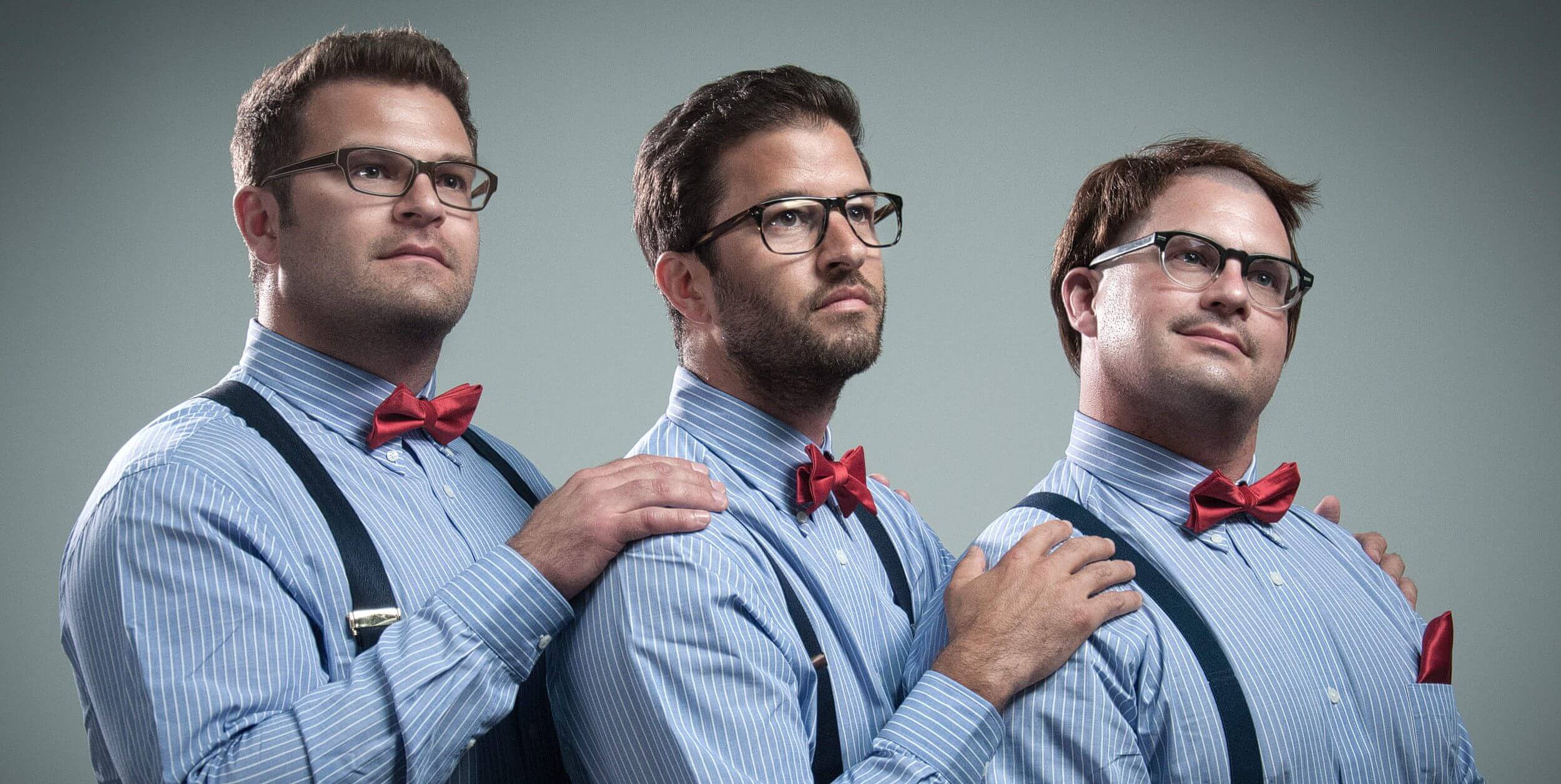
The second design was chosen, which meant we needed to capture, in photographic form, the essence of the silliness that is taking oneself too seriously. Playing off of an Anchorman-esque sense of self-deprecating humor, we had the guys over to our studio for a photo shoot. The head brewmaster, Ryan, found a toupee in our green room. An hour and a thousand laughs later, we ended up with this gem.
Perfect.
Front-End Fun
The design of the site presented some unique front-end development challenges. The heavy use of images meant that we needed to manufacture ways to reduce file size and load times. The first way we did that was to make use of SVG clipping instead of relying on transparent PNG files. JPG compression can mean a 70% reduction (or more) in file size, which is huge. It also allowed for more flexibility with reuse of the same file in other places, instead of having one clipped PNG and another unclipped JPG.
Another tool we used was SVG’s image filtering capability. CSS filters are promising, but are currently unsupported in IE11. More to it, CSS filters cannot currently replicate a Gradient Map in Photoshop, that is, map the darkest and lightest points in an image to specific color values and fill in everything between. Using SVG gave K4 the freedom to upload any images to their site and have the color effect applied in the browser, instead of calling on us to generate filtered images.
Baby Got Back-End
The needs of a brewery demanded that we build some beer-specific management tools. Building a custom Beer Manager in WordPress made it easy for them to add a new beer to their site quickly and easily. It also meant managing that information in only one place, and then spreading that information across numerous locations.
Wrapping it Up
When all was said and done, we’d built a website for Karben4 that, for the first time, both met their needs and told their story. If you think your heart can handle it, head on over to the new Karben4.com and have a gander.
