
The Evangelical Catholic is a non-profit that builds and trains leaders to build and train more leaders, growing fledgling ministries into thriving communities.
Beginning as a ministry model for college students, the EC has grown into an organization that serves not only college campuses, but parishes and dioceses as well. However, the passion and vibrance one would expect from those who’ve cut their teeth reaching out to college students has not been lost. But that spirit, embodied by the St. Paul’s commission to, “run so as to win,” was not reflected at all by their outdated website–the first impression of the organization for donors and potential adopters of the EC’s model.
Bridging the Gap
There can be no mistake, the EC is unequivocally Catholic. They embrace and represent all of the beauty and depth of the Catholic Church. Blending that reality with the youthful exuberance needed to penetrate the peripheries of college campuses was the challenge set in front of us.
We knew that the look and feel of the new site would have to be both energetic and beautiful. Starting with bold, bright colors and some outside-the-box geometry, we developed a look that could not be mistaken for anything other than modern. In the background, we incorporated artwork from the Renaissance that clearly established the traditional foundation of the organization.

Voice in the Wilderness
A major component of the “new brand” for the EC would be the voice and attitude conveyed by the site. Punchy headings that exuded confidence and passion would go a long way to effectively painting a picture of who the EC is and what they’re about.
The director of the EC, Jason Simon, is fond of inspiring those around him with Nike-esque exhortations of “C’mon, let’s do this!” and “Get up! Get off your butt and go!” There is a coach or trainer-like quality to it, and the reality is that it works. It’s inspiring.
It is that same “you can do this” attitude that needed to come out in the various calls to action peppered across the home page. Inert phrases like “Read More” or “See Details” were replaced with expressions like “Let’s Get to Work” and “Let’s Talk.” Passionate people run the EC–so it was only fitting that their new website reflect that.
All Things to All Devices
Certainly a major problem with the existing site was that it was effectively unusable on anything that didn’t sit atop a desk. Though we wanted to push new design and development techniques, we had to retain the ability for the site to fold down into the pocket of the user. Building responsive sites that maintain their beauty is a challenge, but a challenge we met head-on.
Branding Takeover
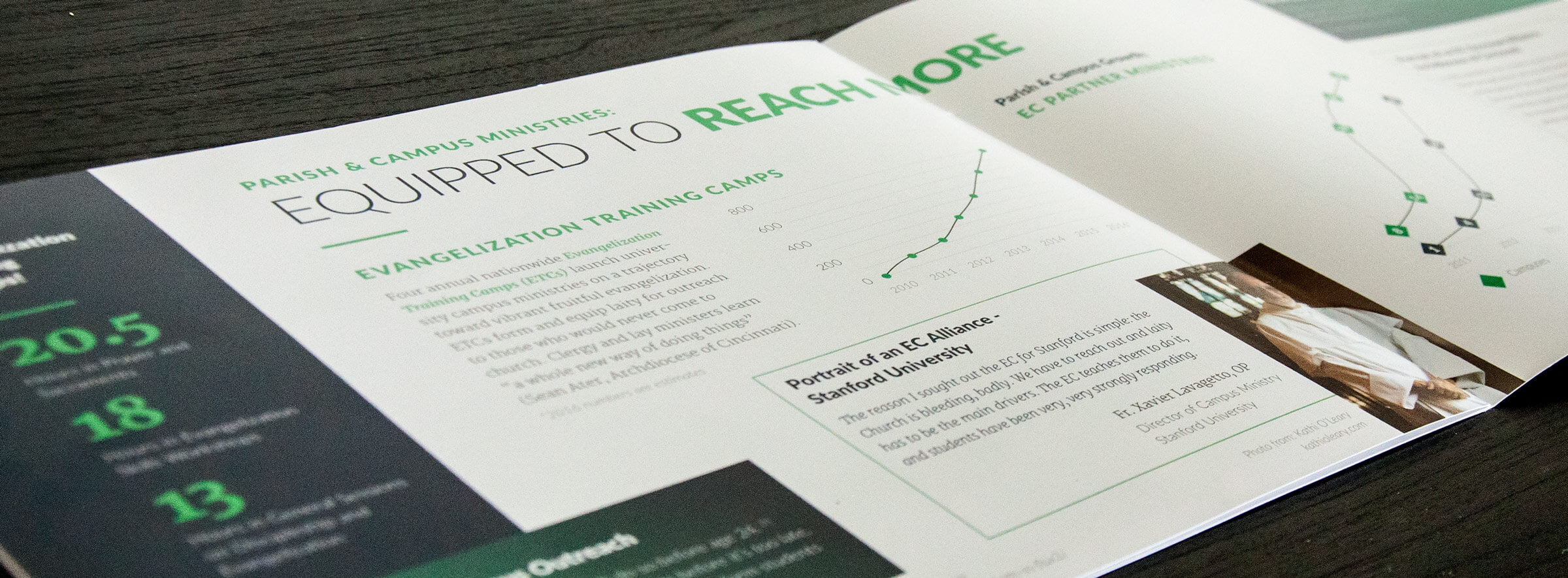
A year after the successful launch of the website, the EC wanted also to up its game in the print department and ensure that their new brand was maintained in their annual report. We picked up the project at the 11th hour after it had been dropped, and churned out a piece that has turned heads and drawn compliments since it was released.
The new material makes a clear statement that the EC is not playing the role of the Little Engine That Could anymore. They are legitimized and ready to be reach out to the existential peripheries of America. To reach not only into college campuses but into parishes and dioceses as well, meeting the needs of the flock wherever they are at.